Tuesday, July 12, 2011

Sky Blue Sky

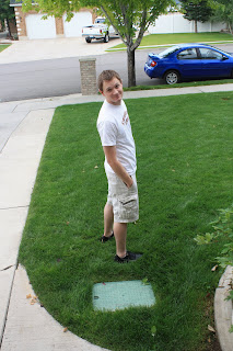
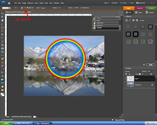
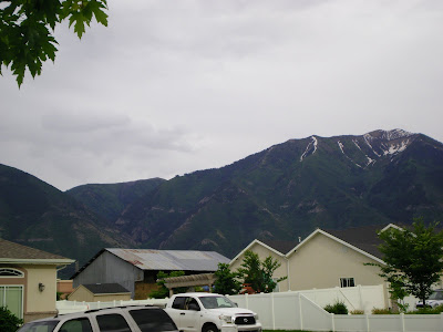
In this tutorial, I'm going to show you how to make a dreary overcast sky like the one below into a picture perfect landscape. Start with your image, preferably one similar to this.

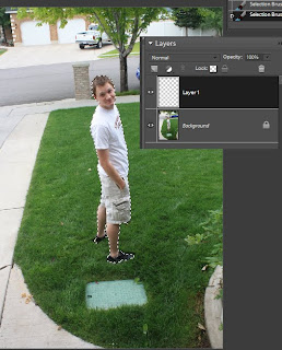
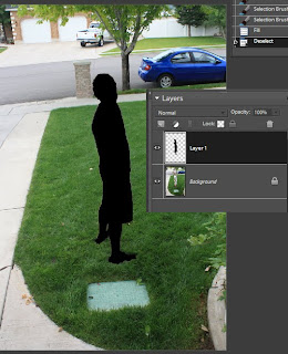
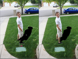
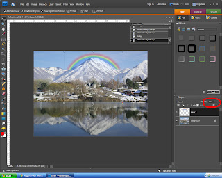
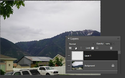
Step 1: Select the sky, and open a new blank layer. hopefully you won't have an annoying tree branch in your way. I could have gone over it, but I chose not too for the tutorial.


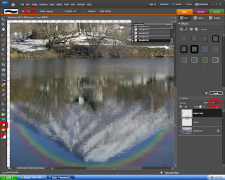
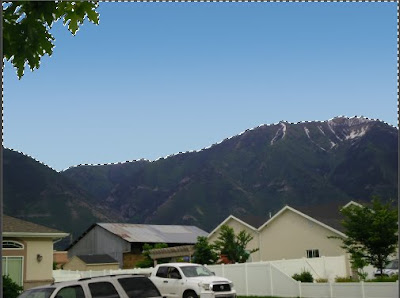
Step 2: go here, http://www.brusheezy.com/Gradients/3046-15-Realistic-Sky-Gradients and download the gradient pack. It comes with a lot of different and useful ones, but we will only use the clear blue for this. When you have the gradients loaded, place it on the new layer you made in step one in the selection. I found you need to start the gradient line tool thing high off the picture and end right at the horizon for the most realistic effect.


Step 3: Go here, http://www.brusheezy.com/Brushes/10710-Clouds and download the clouds brush set. load the brushes, and then put them on that same layer. Make sure they are white! after that, you have a picture-perfect blue sky!!


Friday, July 8, 2011

Makin' a Shadow


So, a fun trick that i recently learned is how to make a realistic shadow. It helps to make objects that you put into other photos look a little more authentic. So, I'll start with my picture. I just took a picture of a subject that didn't have a shadow, but you can easily do this same thing with a person you put on a new background or something.


Now, select the subject that you want to put a shadow on. Then, create a blank layer.

Then, on the the new blank layer, fill the selection with black.

Then, under Transform, (under the Image tab in Elements) click "distort", and move your shadow layer into a realistic position. Then use the eraser tool to get rid of any parts that cover you subject or are out of place. (some will be because of distortion)

Then, go to the filter tab and under the blur menu, click "gaussian blur". depending on the resolution of your picture, you may need to raise it more than other pictures. Play around with it until you find the perfect setting. From there, all you do is lower the opacity a little bit so it looks like a real shadow! and that's all! here's how mine turned out!

Wednesday, June 29, 2011

The magic of Brushes


I recently started playing around with Photoshop brushes that one can download offline. I've already gotten nearly two hundred, and they were all free! They can be used to make amazing effects, like in the picture I'm about to show. The easiest way to get the new brushes is just to use a search engine like Google to find a website that has an assortment of them. They all download a little differently; some come in zipped folders, some as RAR, and others in the correct format. If yours come in one of the first two, you simply need to extract the files to the desired folder. then, in the brush menu, click "load brushes" and click the ones you want! here's a picture I made with some of my new brushes!

I was going to put this picture onto a cool background, but the lighting didn't match at all. anyway, there is a fun project for you all to have fun trying. I will make a really cool picture with these new brushes soon and post it.

Saturday, June 18, 2011

Making a Rainbow


Today, I'm going to go over how to put a realistic rainbow into a picture. I used Photoshop Elements 7.0, but it should work with any other kind of Photoshop. I started out with a picture i took.


Then, I used the gradient tool on a new layer to apply a rainbow. Make sure you use the circular option up top, otherwise it will make a straight line.


Then use the move tool and the free transform tool to change the size and location of the rainbow. Lower the opacity so that it looks realistic. I put mine at thirty, but it will depend on your picture. I also used a feathered eraser to get rid of most the rainbow, except the parts I wanted.

Lastly, I copied that layer with the rainbow, (Ctrl+J) and flipped it upside down and put in over the reflection of the mountain. I had to lower the opacity again because it looks darker in the reflection. I found that about Fifteen percent was just perfect. then, for the final touch, I used the smudge tool with a very fine brush on the reflected rainbow layer to give it that reflected effect like the rest of the picture.


The final product turned out like this! Tell me what you think!!